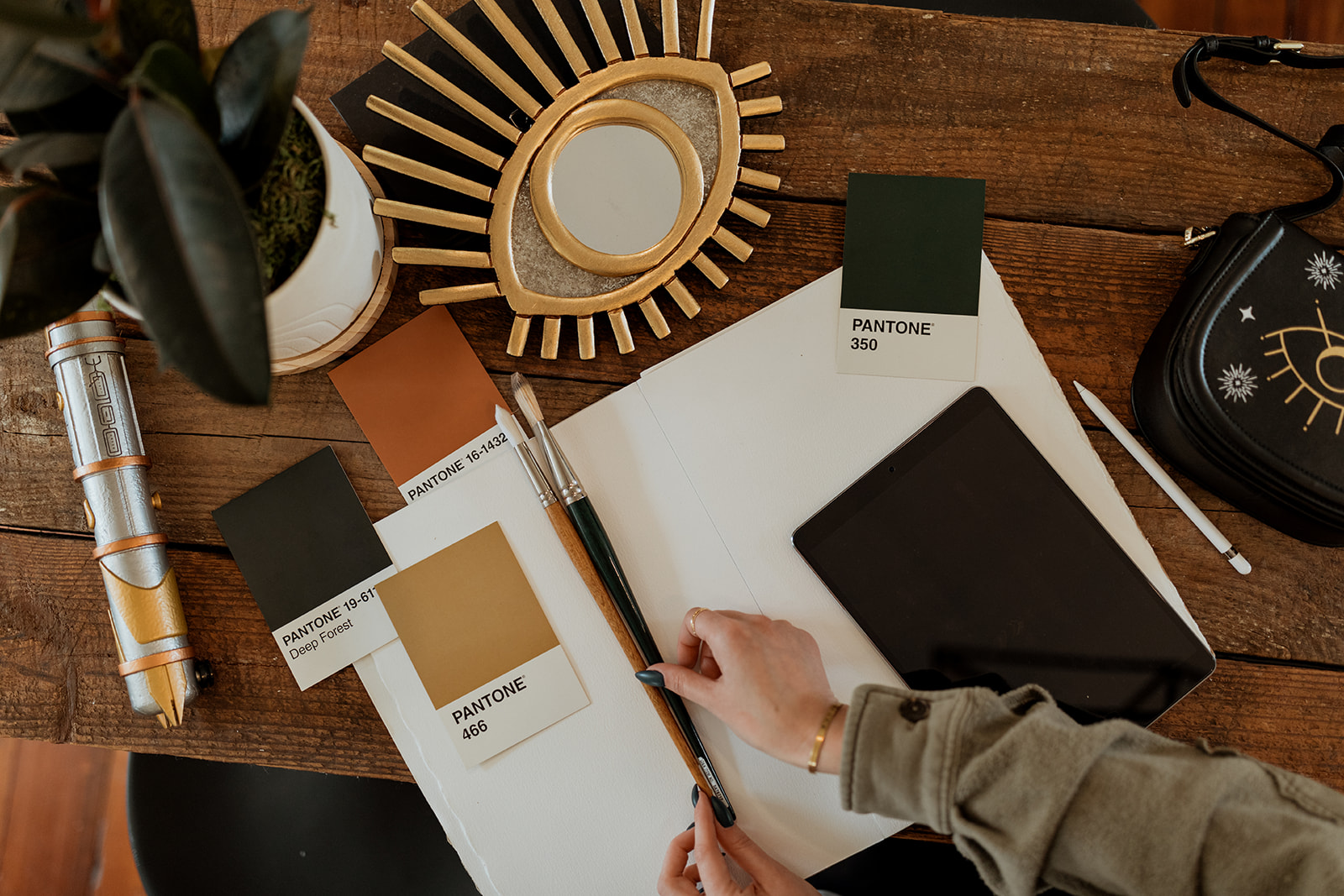


It’s no secret I LOVE color. But choosing colors for your brand palette can be a daunting task. Color has a huge psychological impact on brand perception and who your brand will attract. While the personal preference of color can be a starting point for making your selection, strategically choosing your colors should not be overlooked. Let’s uncover the ways you can select the best colors for a cohesive and effective brand palette.
What colors will attract your ideal client to your brand?
Consider the colors that most resonate with the people you want to work with. What colors do they love? Are there colors that are standard in their industry or niche? When choosing my brand palette, I knew I wanted to attract creatives that love bright and fun colors just as much as I do, so I started with yellow. With my ideal clientele being largely female, I chose to add in some pink hues, which women are inherently drawn to. To add some contrast to the palette, I added some minty, teal hues. To round out the palette, I added charcoal and white hues to appeal to clients that appreciate clean and modern design. If you’re not sure what colors your ideal client might be attracted to, you should consider your brand archetype.
How do you want your ideal client to feel?
What emotions is your color palette going to evoke within your audience? Do your colors give off a vibe of balance, trust, and playfulness? This is another example of the importance of exploring your brand archetype. For example, my top brand archetype is The Creator. My clients immediately know that I’ll be their ultimate guide to creation, originality, self-expression, vision, and imagination.
Colors and their meanings:
Red: energy, passion, and danger
Orange: creativity, youth, and enthusiasm
Yellow: happiness, hope, and spontaneity
Green: nature, growth, and harmony; and sometimes wealth and stability
Blue: calm, trust, and intelligence
Purple: luxury, mystery, and spirituality
Pink: playfulness, femininity, and romance
Brown: wholesomeness, warmth, and honesty
Black: powerful, elegance, and sophistication
White: purity, innocence, and minimalism
Gray: professionalism, formality, and conventionality
How to use color theory to choose your brand colors:
Fun fact: Color theory was one of my favorite classes in art school; it is a science! If you understand color theory, I promise you won’t have a problem creating a successful palette. First, let’s refer to the color wheel:

The 3 Primary Colors: red, yellow, and blue
The 3 Secondary Colors: orange, green, and violet
The 6 Tertiary Colors: red-orange, yellow-orange, yellow-green, blue-green, blue-violet, and red-violet
Color Harmonies:
Monochromatic means using only one color with tints and shades, such as blue, light blue, and dark blue.
Complementary colors appear across from each other on the color wheel, such as red and green. Fun fact: mixing two true complementary colors will create a neutral gray. Adding more warmth between the two will create a warmer gray, and more of the cooler creates a cooler gray. I told you I’m a color theory nerd!
Analogous is achieved by using three colors next to each other on the color wheel, such as red, red-orange, and orange. This will give your palette a monochromatic effect but with much more depth and interest.
Triadic is essentially a triangle of evenly spaced colors on the color wheel. The most basic triadic harmony would be the primary colors red, yellow, and blue.
Split Complementary implies using one color and the two colors adjacent to its complementary color, such as red, yellow-green, and blue-green.
Tetradic involves using a rectangle or square that uses four colors arranged in two complementary pairs. A tetradic rectangle could be yellow, blue, orange, and purple, while a square could be yellow, blue-green, purple, and red-orange. This harmony will give you the most variety but can be overwhelming at times. It’s important to let one color be the primary, while the three remaining colors serve as accents.
Happy Picking!
Now that you know a little bit more about color theory, you can apply it by starting with one or two colors that you chose based on your ideal client and your brand archetype. Also, I would suggest all brand palettes include at least one dark and one light neutral. For my fellow visual learners, I suggest using a color creator or color generator to help you in this process. And if you need some color inspiration, read my post on creating a Pinterest inspiration board that contains helpful color board links.
Once you have your palette, start implementing it into your brand and website, and remember to stay cohesive and consistent everywhere. I guarantee this help you in attracting your ideal client and give you a concise library of color to easily refer to moving forward.


